From general goals to atomic design principles
CARGO Diensten
Brand Design
UX Design
UI Design
PROJECT TYPE: Dashboard design & branding
ROLE: Content strategist, Brand & UI designer
INDUSTRY: Automotive Business
TOOLKIT: Figma, Adobe Indesign, Storybook, pencil & paper
OVERVIEW: A strategically designed, intuitive, and user-centric dashboard for Cargo’s online services, progressing from general goals to atomic design principles.

Introduction
Cargo International is a modern, customer-focused service provider offering full-service support in shipping, importing, and exporting vehicles and other goods.
The company manages international transport for its customers while ensuring compliance with all related administrative requirements.
The business problem
The CARGO Diensten App faces several usability and design challenges:
Inconsistent Design
The application does not adhere to brand guidelines and lacks a cohesive use of UI components, resulting in a disjointed and unprofessional appearance.
Discoverability & Accessibility
Services are not easily findable or accessible. Users are unable to quickly identify all available CARGO services at a glance.
Fragmented Navigation
Links and functions are inconsistently distributed across multiple areas, leading to confusion and inefficiency in locating key features.
Lack of Responsiveness
The application is not optimized for mobile devices and fails to resize properly, impacting the user experience on smaller screens.
Objectives and business goals
The core business objective of CARGO is to increase online sales. This goal can only be achieved if the following important business objectives are taken into consideration:
- Redesign the CARGO’s service App according to best practices and customers’ needs.
- Inspire greater brand loyalty among customers by designing an easy-to-use application that aligns with the latest company’s brand style.
Business requirements
In cooperation with the CARGO’s team, the business requirements were also identified:

Improve Findability & Discoverability
A key requirement for the new application is an intuitive interface that helps users easily navigate and understand features without frustration.
By applying standard design conventions and prioritizing valuable content, the dashboard will improve usability, reduce cognitive load, and boost accessibility and engagement.

Design a consistent User Interface
UI & brand consistency supports usability, scalability, and trust—not just aesthetics.
To achieve this, the project requires a UI style guide and UI kit based on the latest CARGO style, which will evolve into a component library and, eventually, a full design system.

Provide a Responsive Design
Responsive design ensures seamless performance across devices.
By using modular UI components based on atomic design principles (atoms, molecules, organisms) and making them reusable across different screen sizes, the application will improve usability, accessibility, and engagement while staying competitive in a multi-device landscape.
Solution
Update the CARGO Diensten App into a modern, user-friendly app with a modular, component-based UI in the latest CARGO style. The redesign will enhance service discoverability, accessibility, and brand consistency with a responsive design.
The solution will be achieved by focusing on key goals:
- Enhancing Service Accessibility and Navigation – The app will simplify service discovery through a clear visual hierarchy and optimized navigation. A new dashboard will prioritize key content and follow established design standards.
- Providing a Cohesive & Branded User Experience – The interface will consistently use UI components that align with CARGO’s brand identity, creating a professional and visually unified experience. An interface inventory will map the current state and guide the creation of a UI style guide and UI kit, based on the company’s Brand Book.
- Adapt Seamlessly to Different Devices – The design will be fully responsive, using modular UI components based on atomic design principles. The UI kit will be defined based on the UI style guide and compiled in the component library (Storybook).
DISCOVER
UX RESERACH
Interface Inventory
As a starting point before my meeting with the key stakeholders of the CARGO Diensten company, I conducted a brief Interface inventory.
An interface inventory follows a similar approach to a content inventory. However, instead of analyzing and categorizing content, it involves identifying and documenting all the components that make up the user interface.
Learnings
The Interface inventory revealed inconsistencies in the use of UI elements and components. To highlight these issues, I created a presentation that clearly showcases the design inconsistencies I found.
The current application contains multiple variations of buttons, input fields, interactive components, radio buttons, checkboxes, text inputs, select menus, headers, icons, lists… Additionally, the navigation lacks uniformity, and typography is used inconsistently throughout the app.
Target Audience – Who are the Cargo App users?
- Company Employees – employees who use the application for administration. They can have different roles or multiple roles.
- Customers – users who can have one or multiple roles depending on the services they use.
Issues with the current Company Dashboard


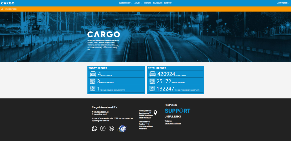
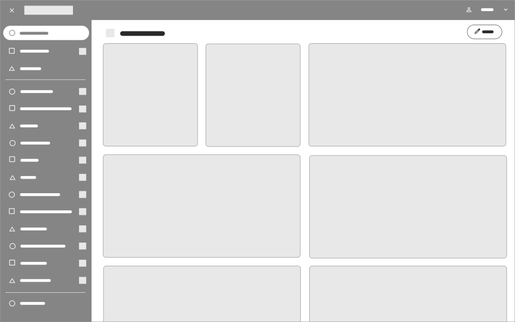
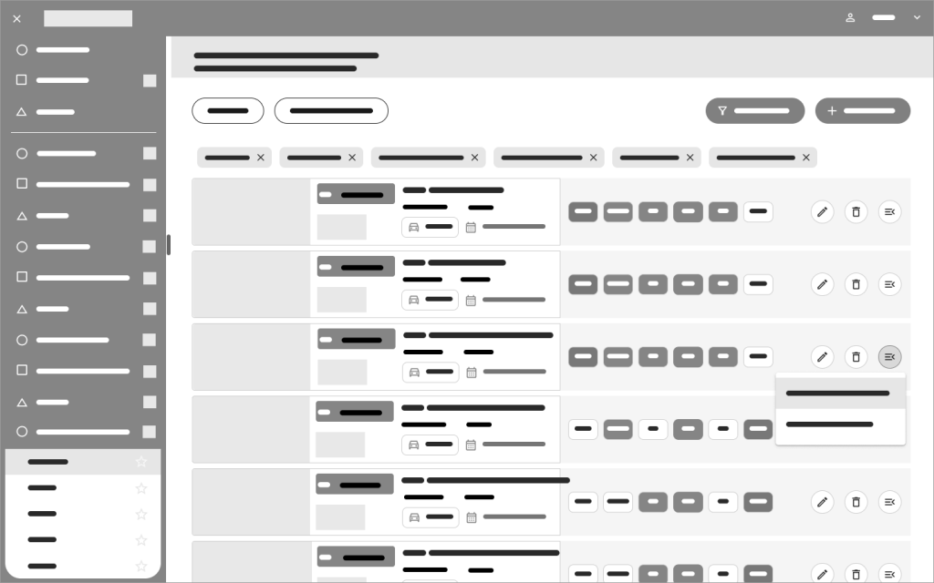
NAVIGATION LAYOUT
The current company dashboard features a primary navigation bar positioned below the header component, containing links to a few key services. Additional services are accessible through categories and links located in the central part of the dashboard.
However, the layout does not effectively indicate which content is of higher importance to the user. Instead, the dashboard primarily serves as a navigation area but lacks an overview of completed activities and essential service-related content for users.

USABILITY CHALLANGES
This layout presents several usability issues:
- Scanning inefficiency: Users have to scan large areas of the screen or navigate between different sections of the application to access the full list of options. This increases cognitive load and slows down task completion.
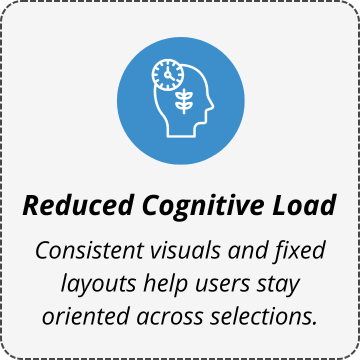
- Fragmented user experience: Movement from one section, window, or page to another usually involves multiple visual styles, formats, or layouts, all of which place a greater cognitive demand on the user. Each transition requires them to reorient themselves and locate the information relevant to their current task(s).
- Memory overload: Frequent movement from one region of the UI to another interrupts the experience of scanning and comparing options. This forces users to rely on short-term memory to retain information, making interactions more mentally demanding.
CONCLUSION
A more streamlined navigation structure could enhance usability by reducing unnecessary movement, maintaining visual consistency, and improving accessibility to key options. Additionally, the dashboard’s content should be clearly defined to ensure it provides relevant and valuable information to users.
Personalized Customer Experience & Customization
“Customization gives control to the user and personalization gives control to the site. Both can enhance users’ experience, but only when carefully implemented.” Nielsen Norman Group
The company has already developed expertise in delivering a personalized customer experience by providing links to specific services based on user roles. For the new dashboard proposal, it is important to enhance this personalization by introducing an overview of recent activities and key user-specific data.
Additionally, users should have the flexibility to customize dashboard components to suit their needs, improving performance and driving better outcomes.
How to Provide Personalized Customer Service
- Monitor user activities and needs to understand preferences and behaviors.
- Deliver “Intelligent Content” by using;
- Modular content and well-defined structure for consistency and content reuse across different platforms.
- Semantically rich content with metadata for better categorization.
In order to differentiate your business, layering customized and personalized product lines into an existing omnichannel model can further enhance revenue, brand awareness and customer loyalty. Forbes
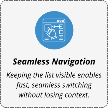
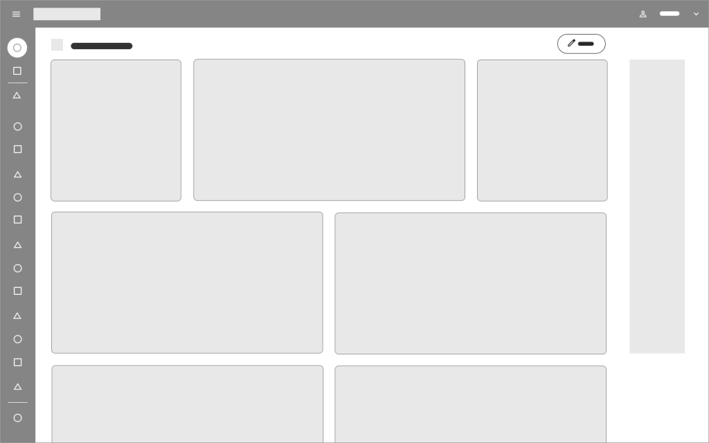
Best Practices for Dashboard Design: Two – Panel Selector and Center Stage
The two-panel selector is a widely used design pattern in web and application interfaces. It allows users to browse a list in one panel while viewing the selected item’s content in another. Commonly found in mail clients and file explorers, this familiar layout enhances efficiency and ease of navigation by enabling quick switching between items.
Center stage is a common UI design pattern used to draw attention to key content, helping users stay focused on important tasks. By emphasizing central content with color, size, and clear headlines, we guide users to the most impactful sections of the interface.
Since both designs are common, users are familiar with their interaction patterns. Following universally accepted design standards improves user experience and enhances discoverability.
Why Choose Two-Panel Selectors?

DEFINE
STRATEGY
Product Concept Statement
In the next phase, I met with key company representatives to define the strategy. After discussing issues from the previous phase, we created the Product Concept Statement—a vision to guide high-level needs, requirements, and design for all stakeholders.
The CARGO Diensten Dashboard is being reimagined as an innovative, full-service application that supports the shipping, import, and export of vehicles and goods.
Designed in the latest CARGO brand style, the new dashboard will offer a seamless, intuitive experience tailored to the needs of the company employees and the core users: automotive companies, export companies, and RDW service providers.
The users will be divided into groups, separating them and their services in order to achieve a personalized and customizable dashboard that each user can alter to make his/her life easier.
Built on atomic design principles, the dashboard will use reusable UI components to ensure consistency, scalability, and adaptability across all screen sizes. This approach will enhance usability and accessibility, enabling the application to thrive in a multi-device environment.
By combining innovation with the latest brand guidelines, the renewed dashboard will not only elevate the user experience but also strengthen brand loyalty and maintain CARGO’s competitive edge in the professional landscape.
A Purpose-Filled Dashboard
After defining the Product Concept Statement, the next goal was to identify the dashboard context and its type, establishing context and guiding data presentation.
The CARGO team has identified the key elements of the new dashboard as follows:

| Scope SPECIFIC | We are creating a dashboard with a clearly defined focus, centering on a specific function, process, or product—namely, CARGO’s services. |
| Business Role OPERATIONAL | Functioning as an operational dashboard, it will provide a focused, near-term, and tactical view of the services being in use. It will highlight recent activities, keeping users updated on their most relevant tasks. |
| Time Horizon HISTORICAL & REAL TIME | The dashboard will incorporate both historical and real-time data. Historical data will allow users to track trends and analyze past performance, while real-time updates will present activities as they happen, ensuring immediate insights. |
| Customization CUSTOMIZABLE & PERSONALIZED | To enhance usability, the dashboard will offer customization features, allowing users to tailor their view to their specific needs for a more relevant experience. Additionally, personalization options will adjust content based on user roles, providing a more intuitive and efficient interface. |
| Level of Detail GENERAL | While the dashboard will maintain a general overview, it will provide links to detailed information, allowing users to explore data further when additional context is needed. |
| Point of View PERSPECTIVE | Designed with a prescriptive approach, the dashboard will be more than just display data—it will interpret the information and provide actionable insights. This will help users understand what the data means and what steps they should take next. |
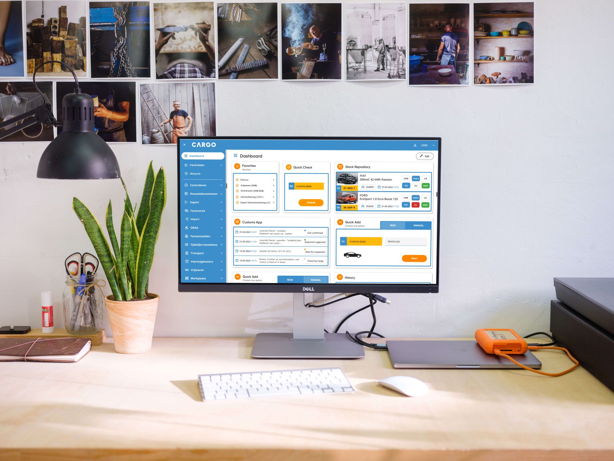
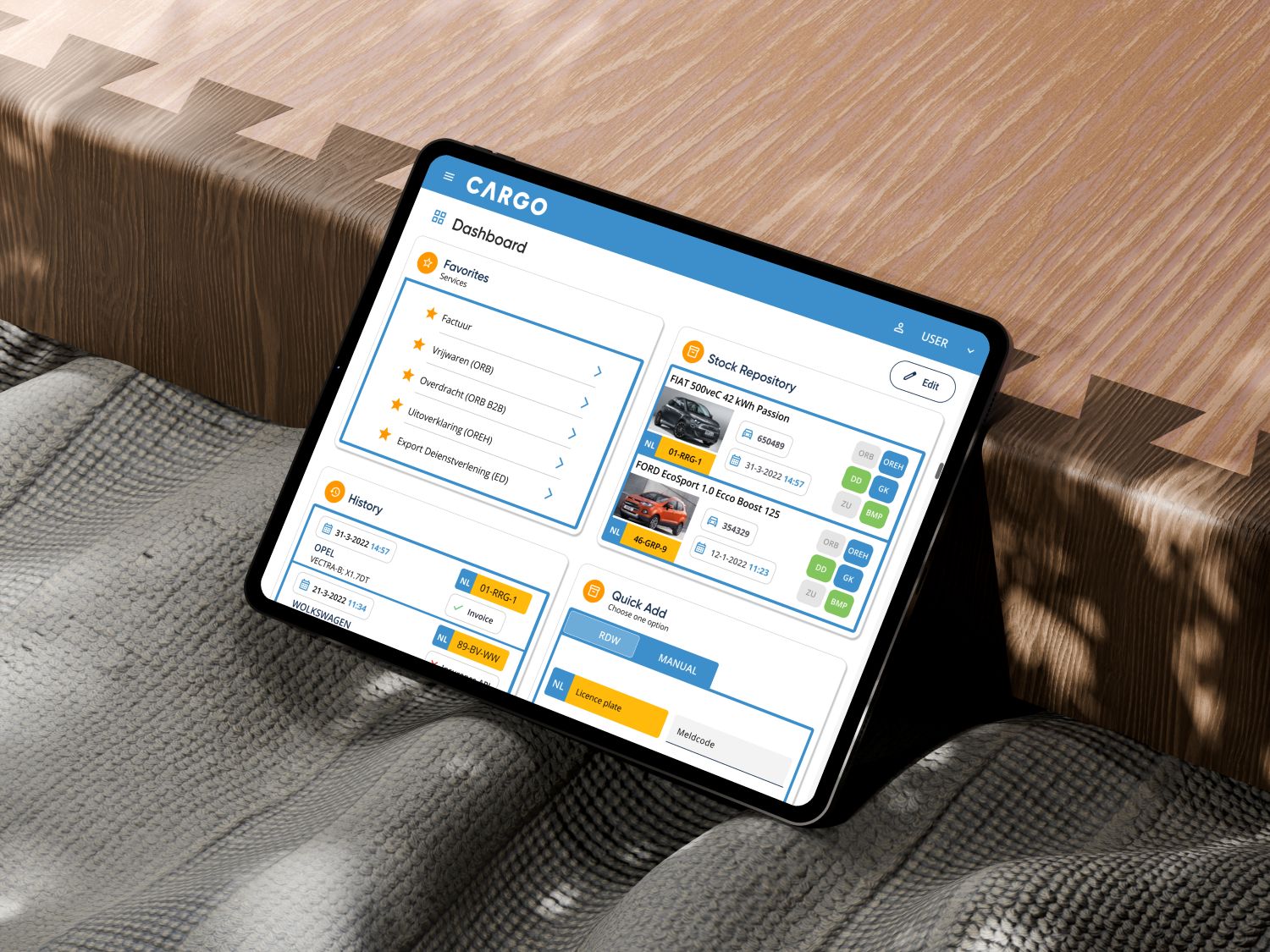
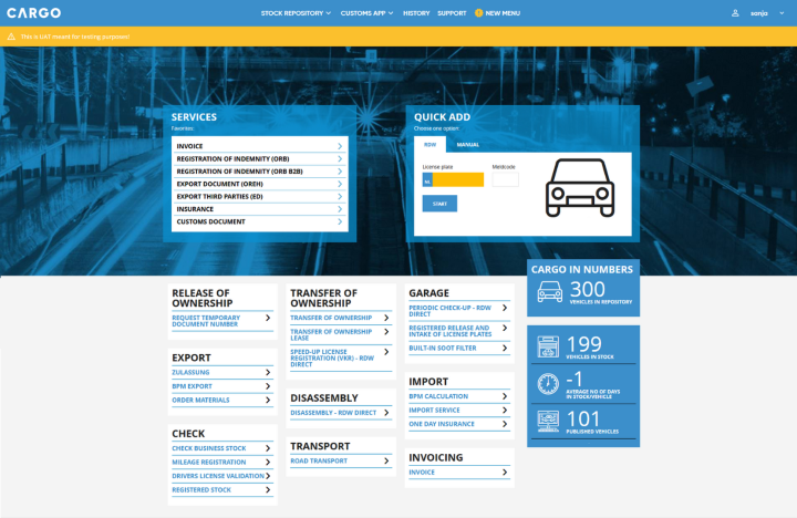
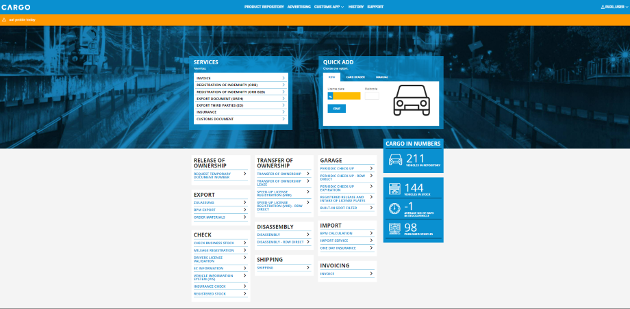
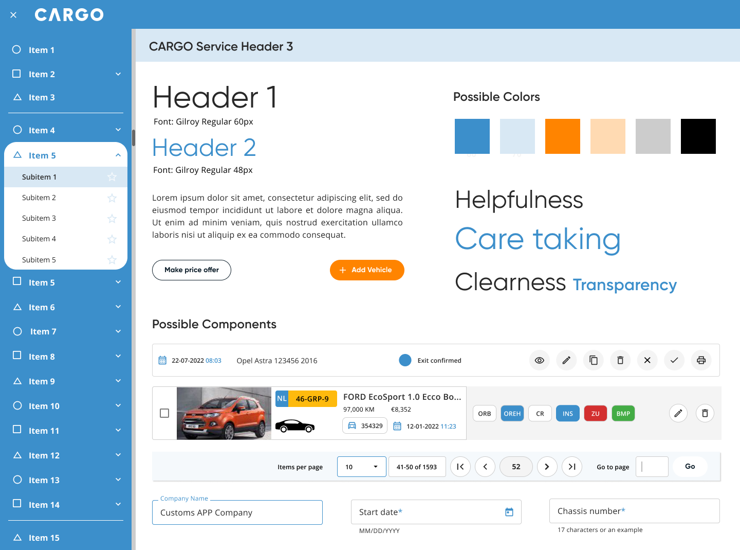
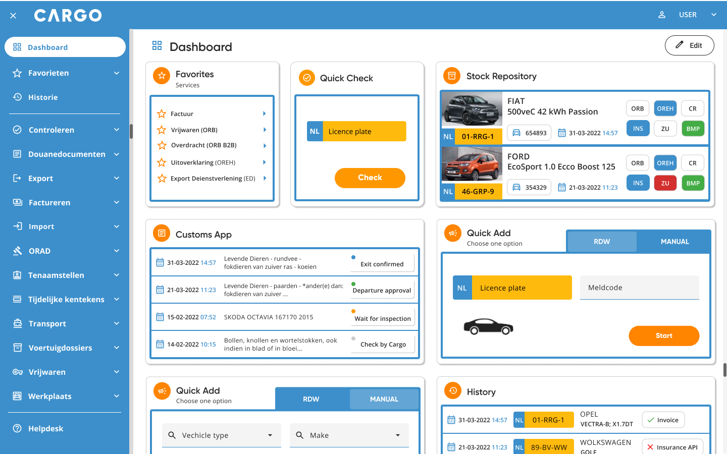
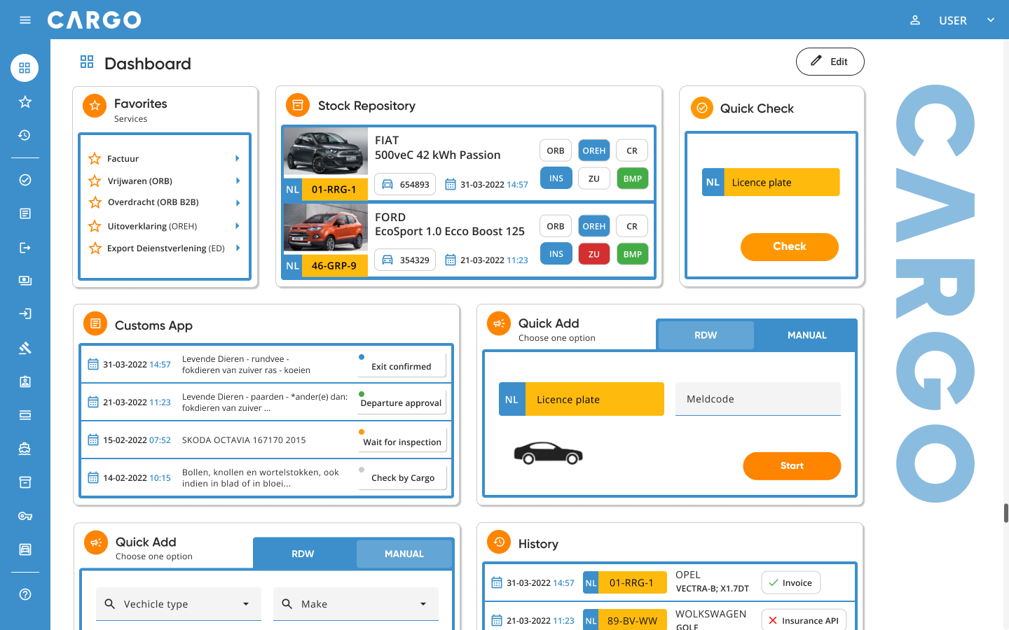
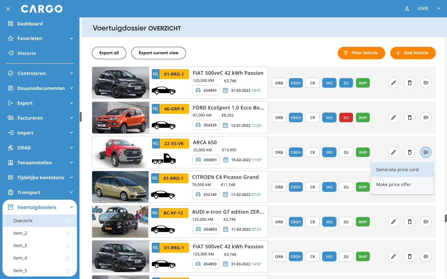
New Dashboard Concept & Layout

Dashboard Design: Two-Panel Selector with Central Stage and Intuitive Navigation
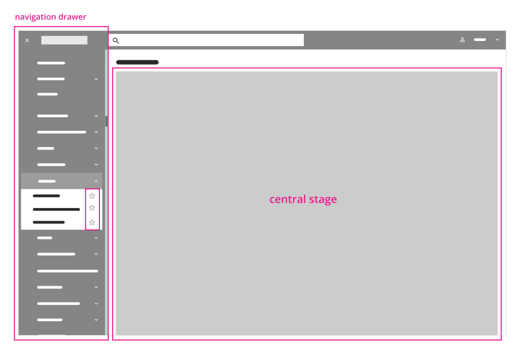
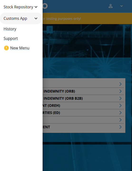
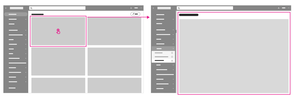
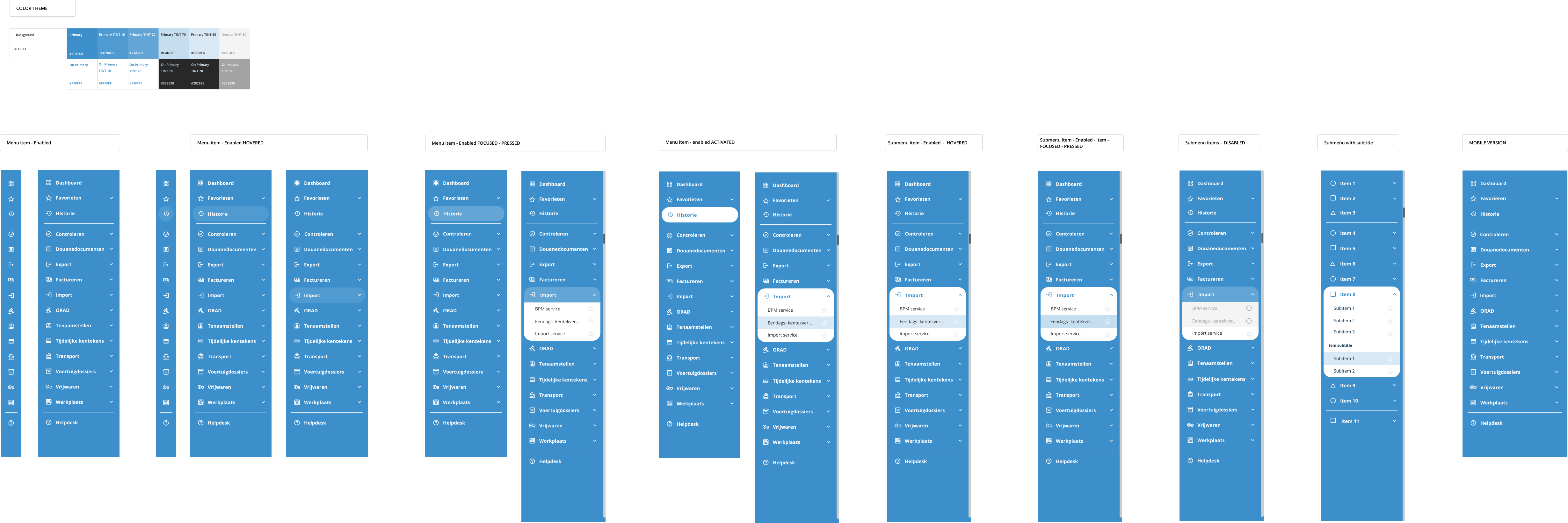
The dashboard follows a two-panel selector design pattern with a central stage. All company-provided services are listed in a side menu (drawer) positioned on the left to align with Western users’ natural left-to-right reading pattern. These services are organized into categories and subcategories, which are displayed as menu and submenu items. Users can mark favorite items using the star icon next to menu entries. A menu filtering function is also planned for future implementation.
The side menu offers quick access to each service, displaying the selected content instantly on the central stage. This design ensures intuitive navigation, allowing users to move seamlessly from a broad list to specific details.

Personalized Dashboard Layout: Accessible Widgets and Consistent Navigation
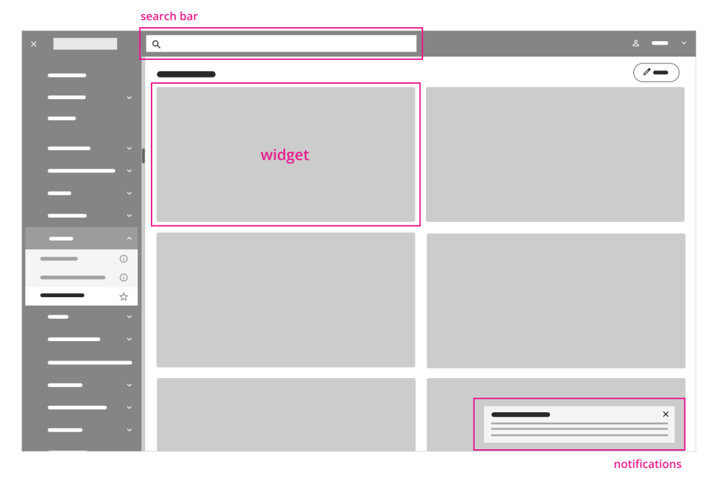
On the dashboard overview page, all services are organized into widgets displayed based on the user’s roles and activities. This setup provides a quick and easy overview of ongoing tasks and frequently used services.
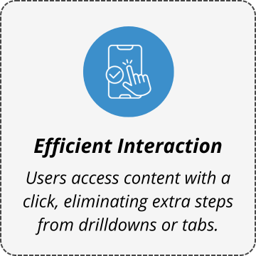
All widgets are placed in the central stage—a dedicated space tailored to the user—with the option to scroll vertically. Additionally, 99% of daily tasks and checks are accessible directly on the screen, minimizing the need for extra navigation.
General search and notification handling remain consistent across all services, ensuring that users always know where to find information and how to navigate, even when using a new service.

Customazing the Dashboard: Edit, Rearrange, and Personalize Widgets
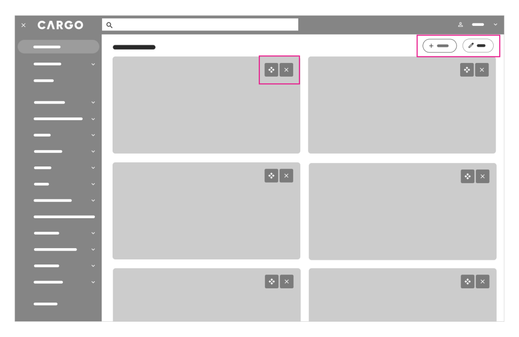
When selecting the Edit button (located in the top right corner), the user can customize the dashboard view by adding or removing widgets as needed. They can also rearrange widgets by dragging and dropping them to adjust their order.

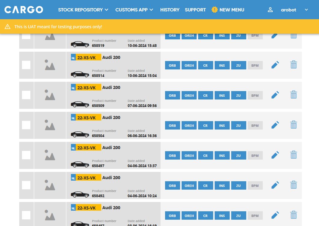
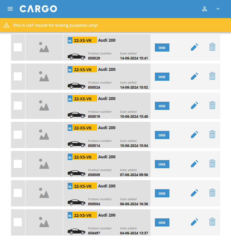
Color-coded Side Menu: Status Indicators and Access Notifications
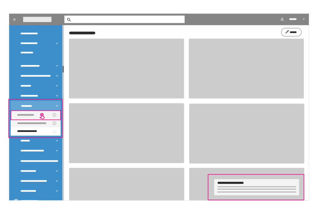
Services in the side menu bar are color-coded based on their status: active services are highlighted in the primary color, while disabled services appear in grey. This approach maintains a seamless user experience while allowing for subtle up-selling opportunities without disrupting daily workflows, which is crucial for the company.
If a user clicks on an inactive service, they will receive a notification informing them of restricted access.

Info Icon: Providing Service Descriptions and Subtle Promotions
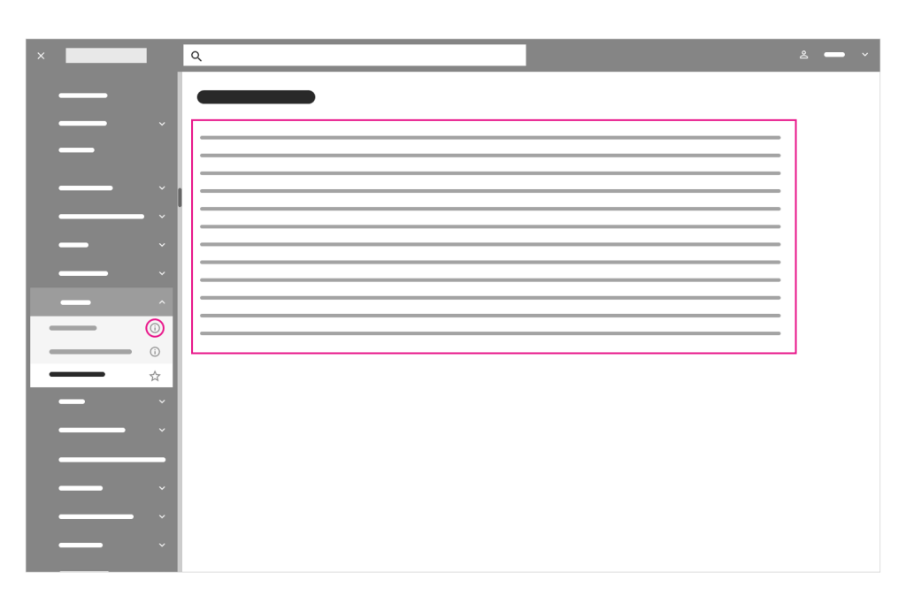
Clicking the info icon next to an inactive service provides the user with a brief description of that service, offering a subtle promotion of the service.

Service Widgets: Quick Access to Detailed Information
Each overview service widget is linked to a page providing more detailed information about the service.
DEVELOP
BRANDING
CARGO Brand Book & visual language
In the next phase, I worked on defining the visual language and UI layout for the application redesign. I organized a design kickoff meeting with key CARGO stakeholders, during which we reviewed the company’s Brandbook outlining its identity, core values, and character.
WHAT DOES CARGO INTERNATIONAL STANDS FOR:
| • Helpfulness | • Care taking | • Clearness | • Transparency |
| • Comfort and convenience | • Partnering | • Processes | • Simplicity in processes |
The Brandbook also includes the company’s logo, brand colors, and typeface, providing a strong foundation for the redesign. Since the client had already established comprehensive brand guidelines, my primary task was to adapt them for the digital environment.
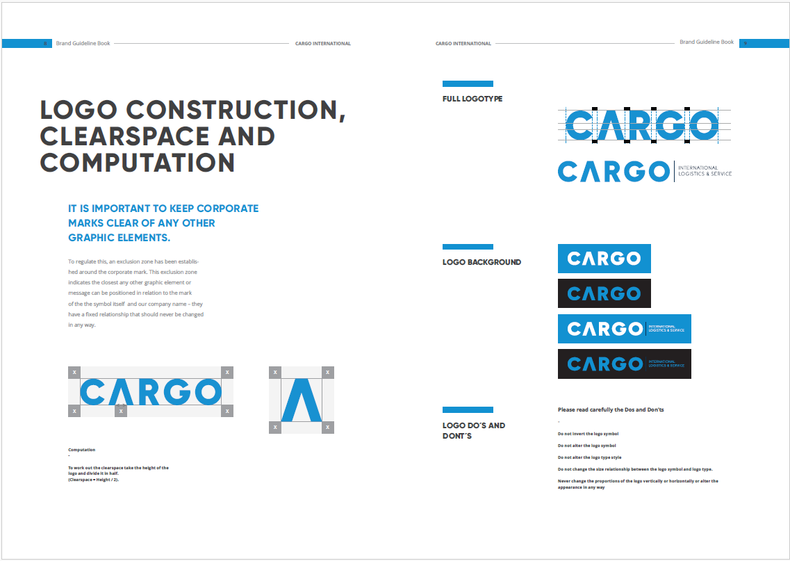
Additionally, an existing proposal for a redesigned landing page served as a reference for my work.

Style Tiles – a Visual Web Design Process for Clients & the Responsive Web
To establish the visual character for the CARGO app redesign, I began by creating several variations of style tiles.
Style tiles help bridge the gap between the broad concepts of a mood board and the detailed precision of a mockup. They are design deliverables that showcase fonts, colors, and interface elements, communicating the essence of a visual brand for the web.
The style tiles helped establish a shared visual language, enabling more focused discussions around the client’s preferences and goals.

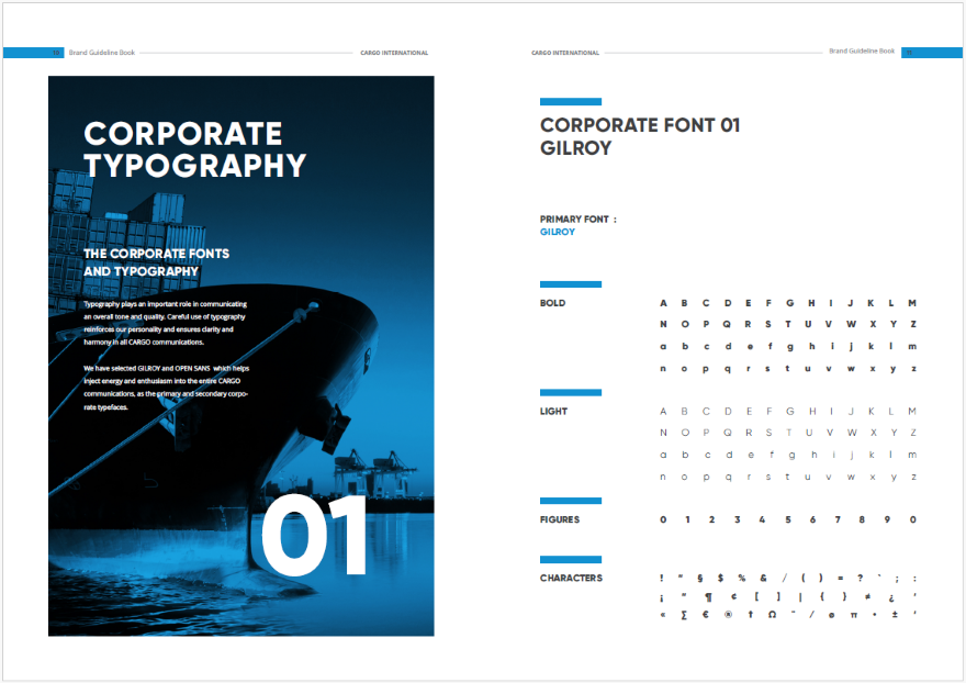
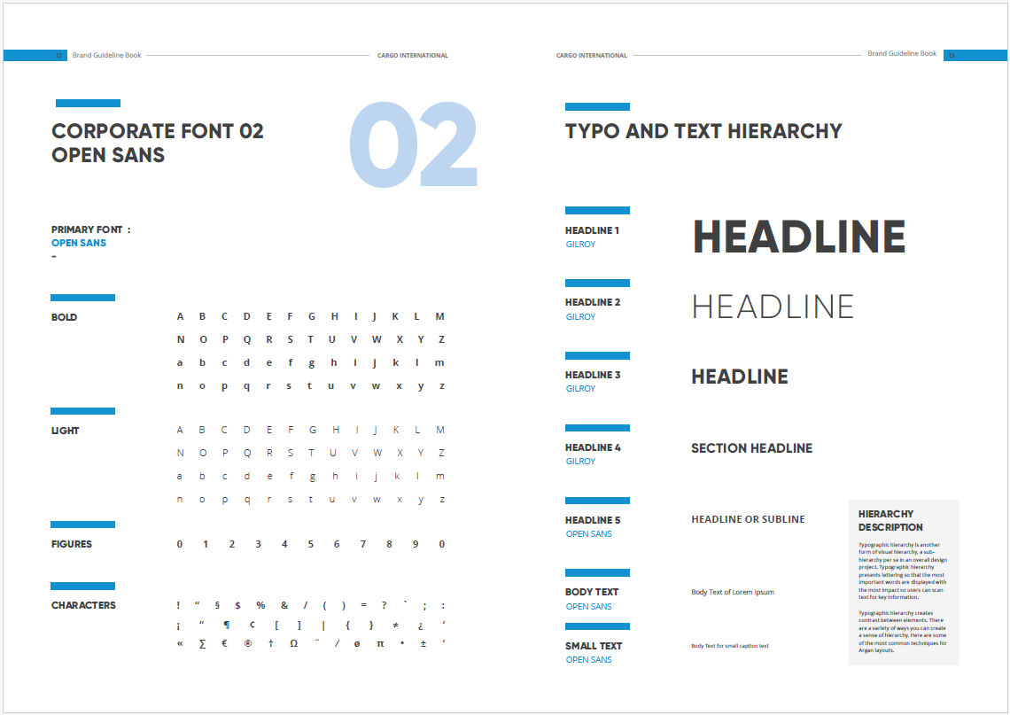
Style Guide
I presented 3 style tile options to my clients—Cargo Style Regular, Light Mode, and Dark Mode—all aligned with the brand’s visual language. We later met to review and discuss these options in detail.
The clients responded enthusiastically to the visual language options. While they expressed future interest in a dark mode, they agreed that Cargo Style Regular was the best fit. Then I proceeded with seamlessly translating the brand colors, typefaces, and iconography to the web application.
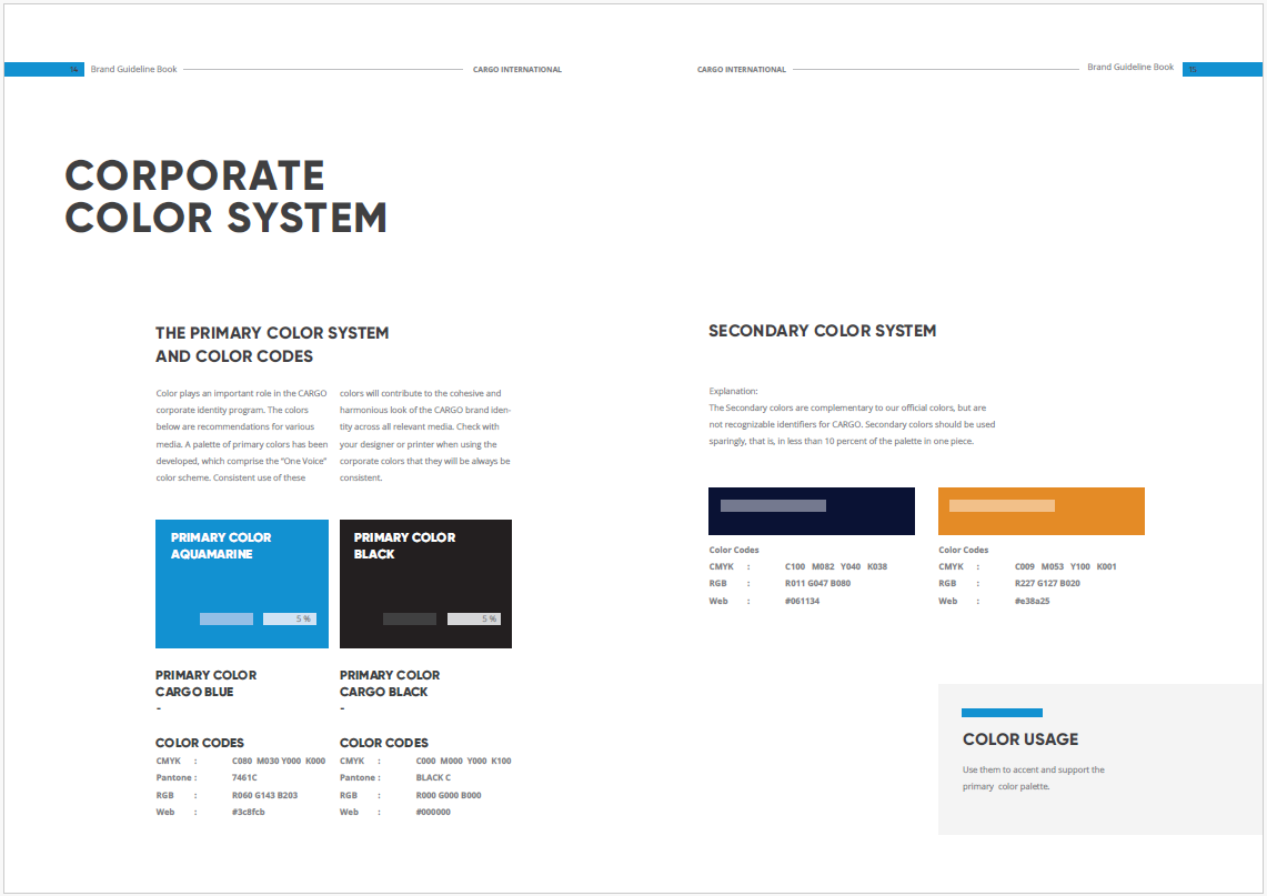
I defined the color palette, tints, and shades, and finally established the baseline color theme. Additionally, I defined the type scale and iconography.

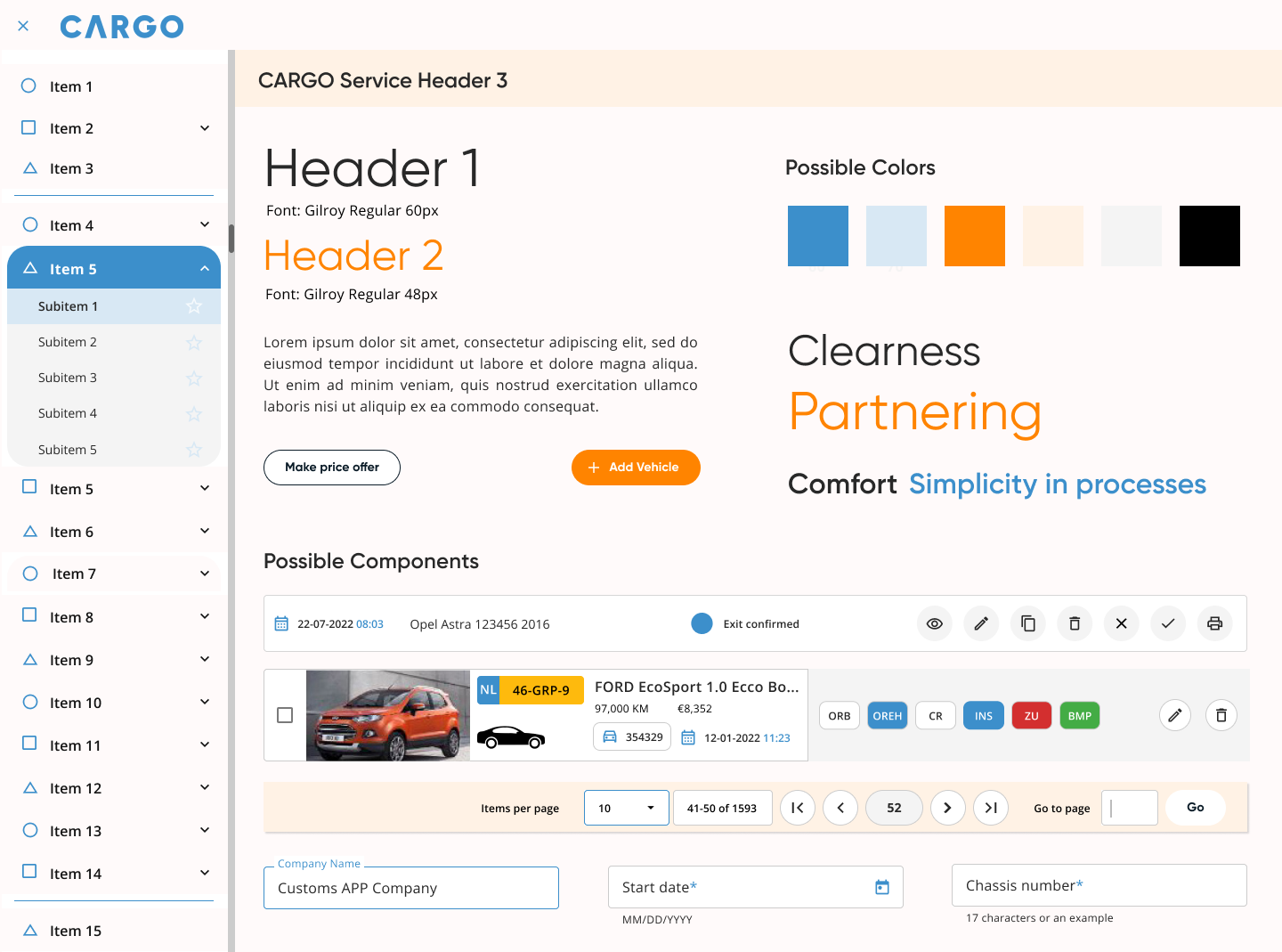
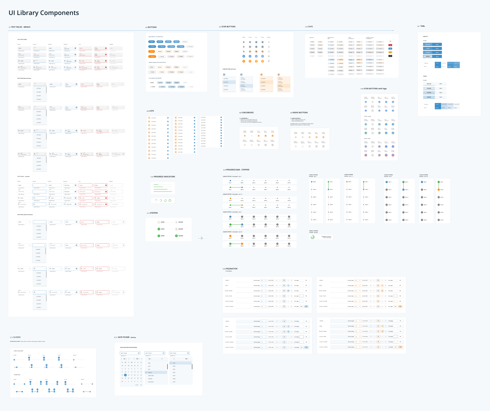
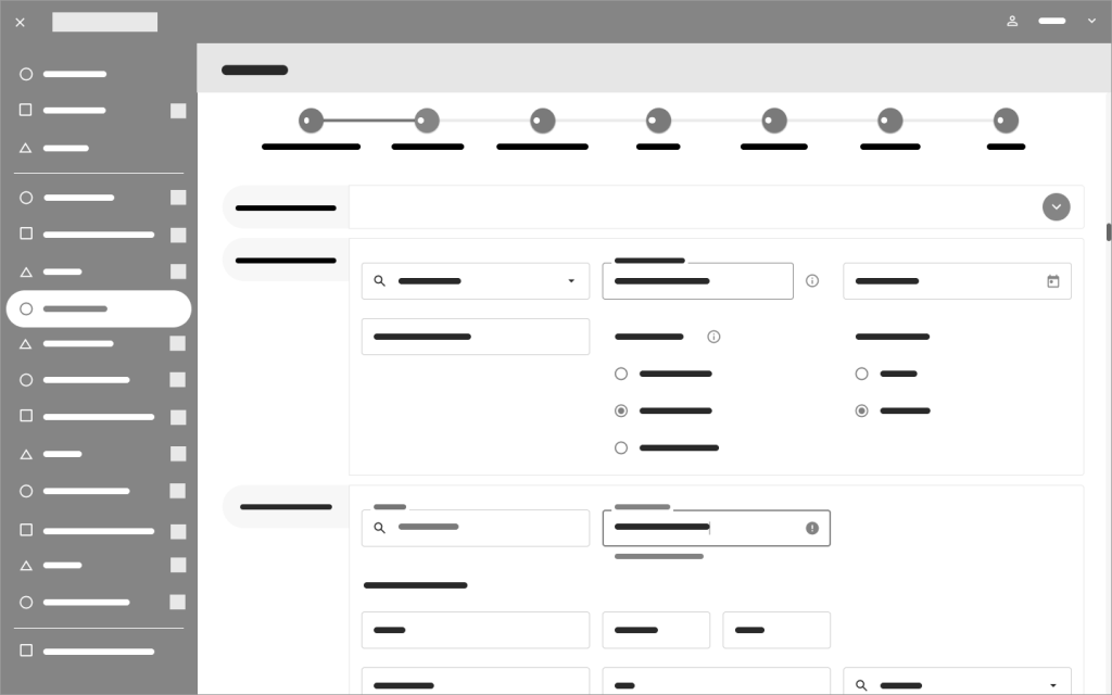
UI ELEMENTS – UI kit – Systematic UI design
The next step was to define a compilation of reusable and easy-to-use UI components that are going to be used to create the user interface of the CARGO App.
I started by defining components like Text Fields, Buttons, Icon Buttons, Primary Navigation Items, Chips, Checkboxes, Radio Buttons, and Tabs. I also defined their states, which are visual representations used to communicate the status of a component or interactive element.
DELIVER
UI DESIGN
Atomic Design
With the aim of defining a modular and systematic UI, the goal was to use the Atomic Design methodology, which is composed of five distinct stages that work together to create interface design systems in a more deliberate and hierarchical manner. The five stages are: 1. Atoms, 2. Molecules, 3. Organisms, 4. Templates, and 5. Pages.
The atomic components previously defined in the UI kit will be used to build molecules, organisms, templates, and pages, as shown in the figure below.
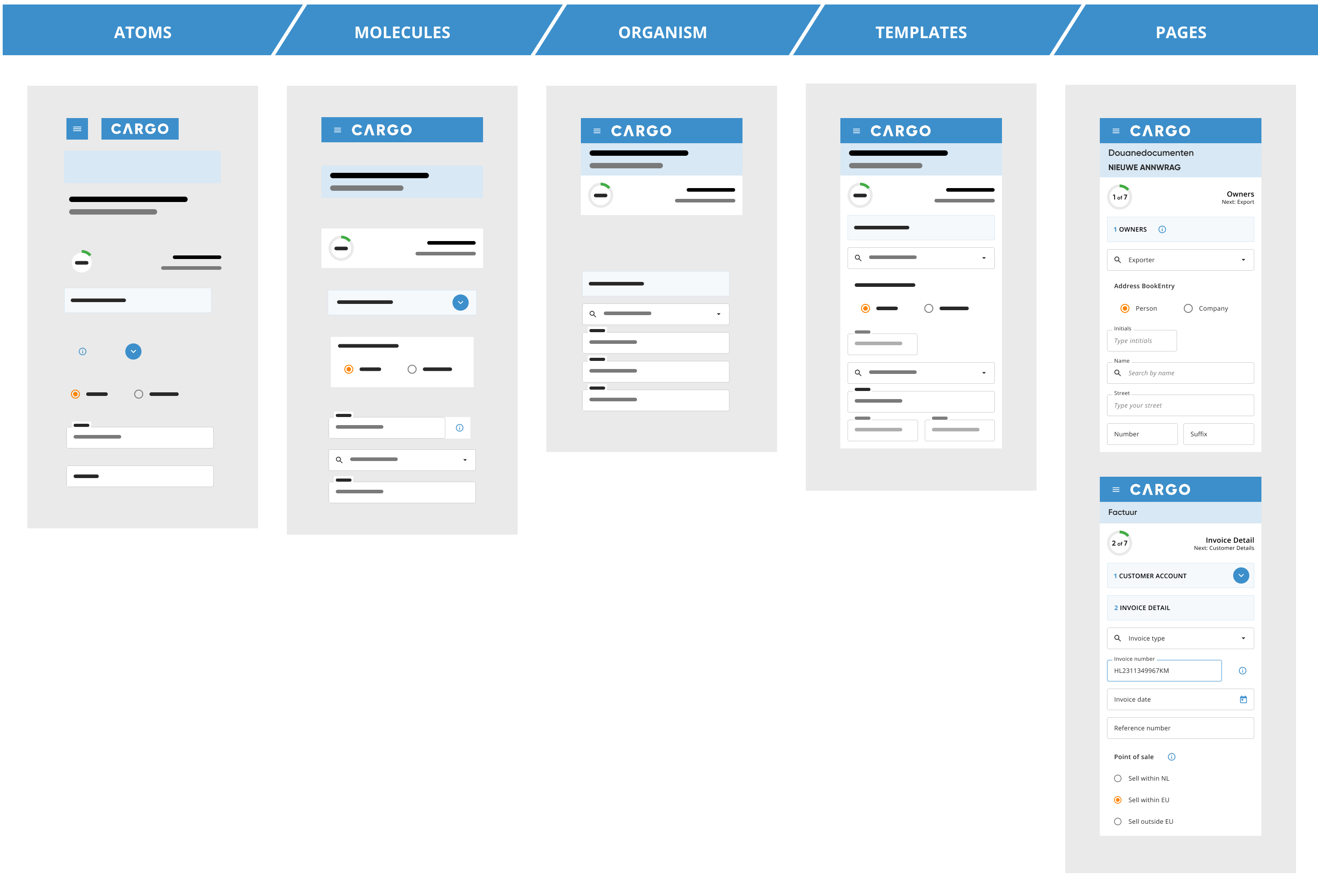
After defining the UI components, I moved forward with the design of the navigational drawer.
Storybook – Component Library
We’re not designing pages, we’re designing systems of components. Stephen Hay (Frost, 2016)*
While I was defining the UI components and building the UI kit, my colleague—a front-end developer—was simultaneously working on the Component Library, also known as the pattern library.
Engineers need their equivalent of a UI kit, but in code. My colleague created reusable snippets of code for the components I designed in Figma. A component library built in Storybook became a collection of code snippets where every team member could browse examples and references for implementation into the codebase.
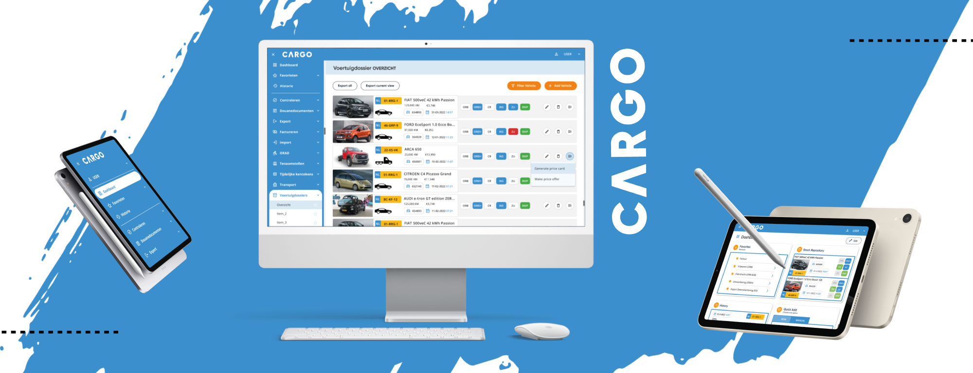
Responsive Design Lo-fi & Hi-fi prototypes
Smart, modular thinking is at the heart of responsive design.
To design effective multi-device experiences, we need to move past the old page-based mindset and focus on building flexible, component-based interfaces. Each UI element brings its own set of challenges and creative opportunities, and it is important to make sure everything looks sharp and works seamlessly across screen sizes and contexts.
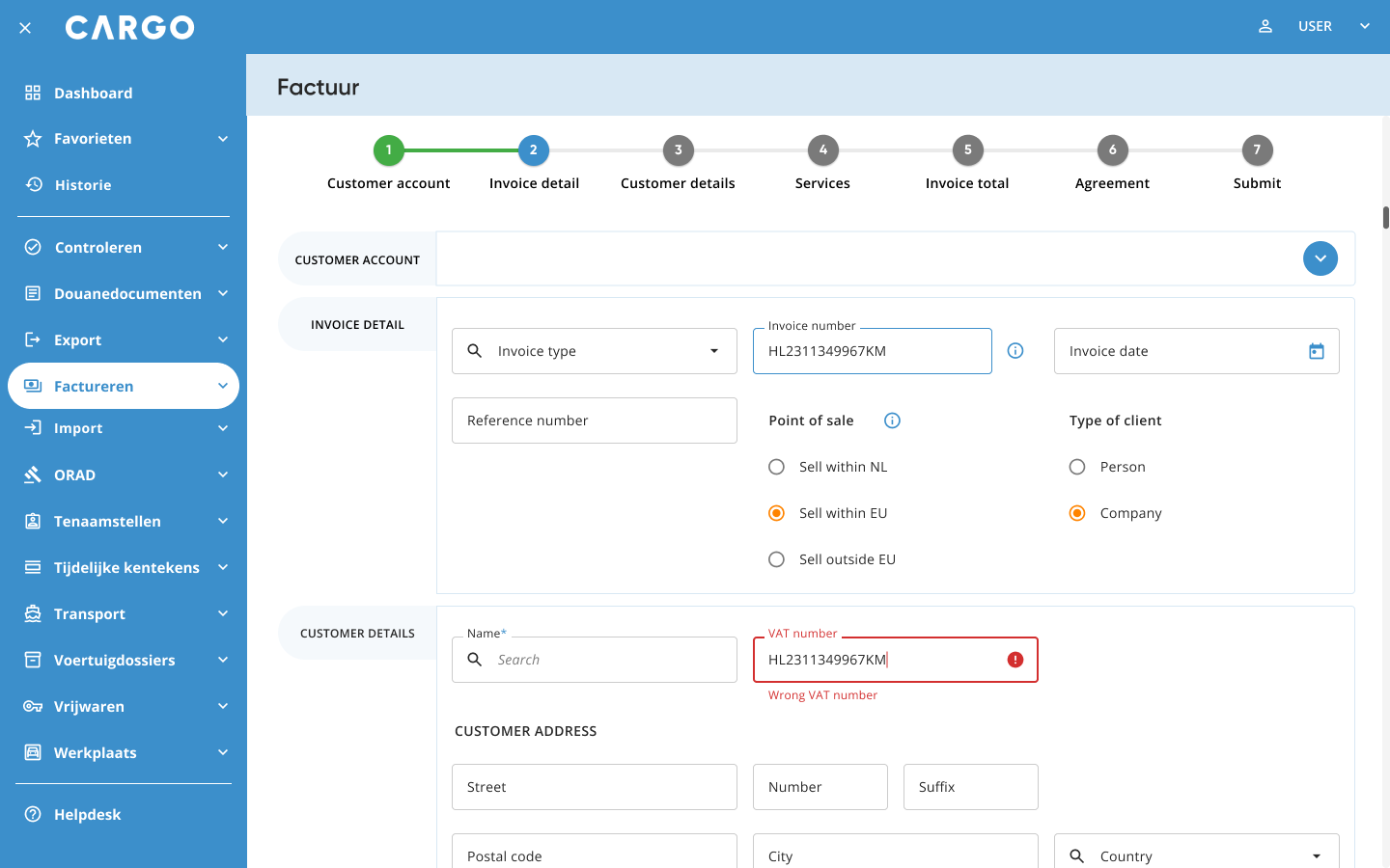
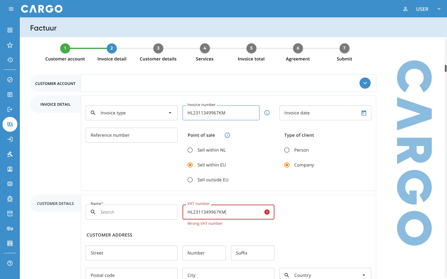
The Cargo application is designed to be responsive, adapted for different devices. The design has different options for layout breakpoints (Material Design standards):
- Large (1440+dp)
- Medium (1240-1439dp)
- Medium (905-1239dp)
- Small (600-904dp)
- Extra small (0-599dp)
Lo-fi & Hi-fi prototypes
Dashboard
Stock Repository

Invoice
* Frost, B. (2106). Atomic Design. Brad Frost.
 BenSan Design